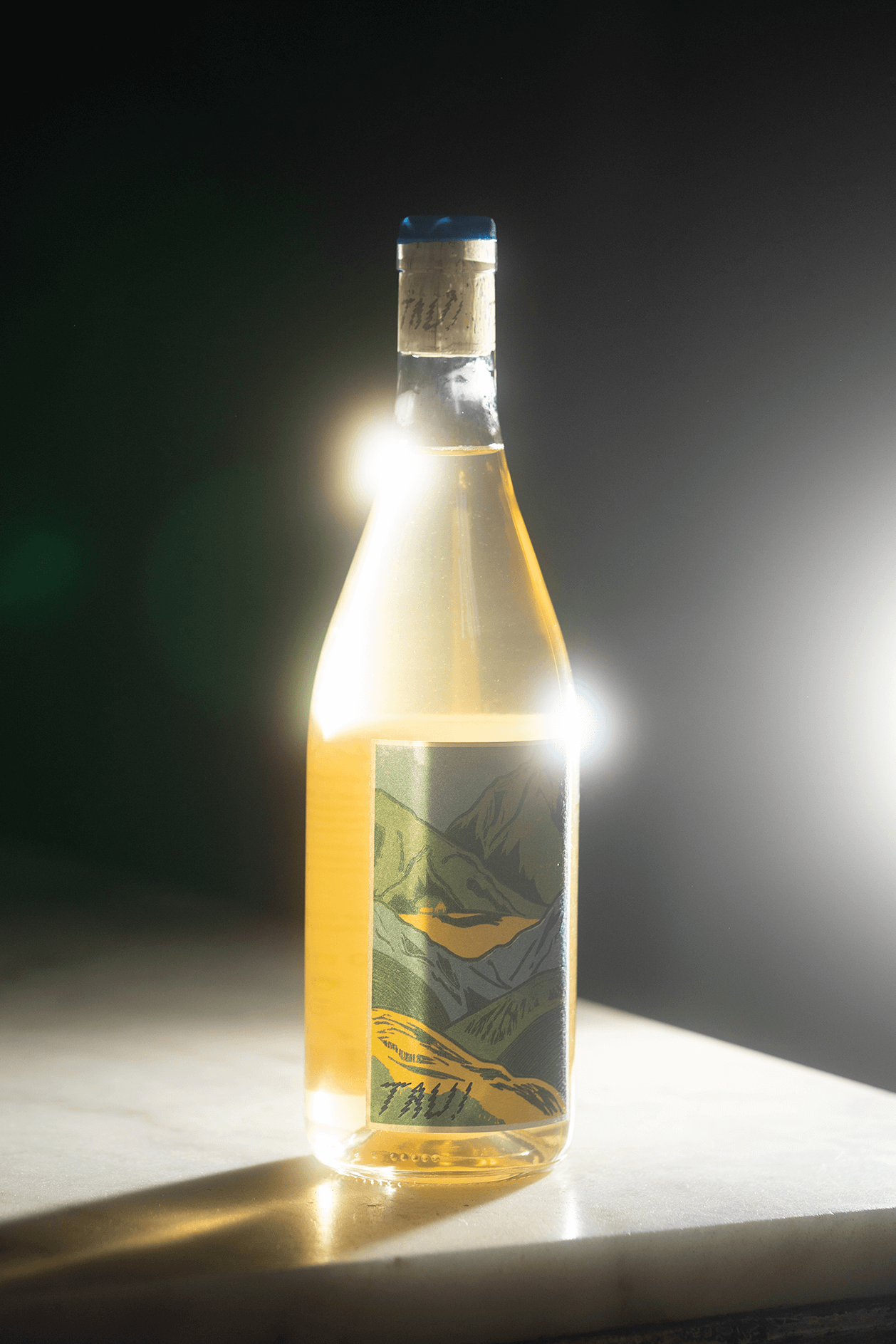
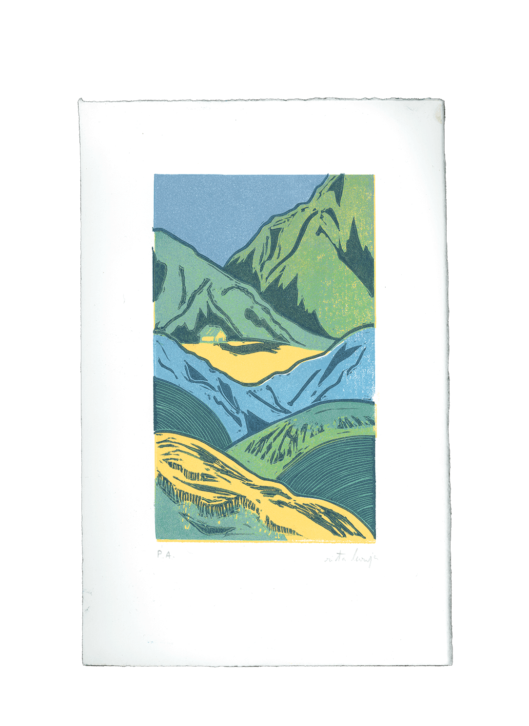
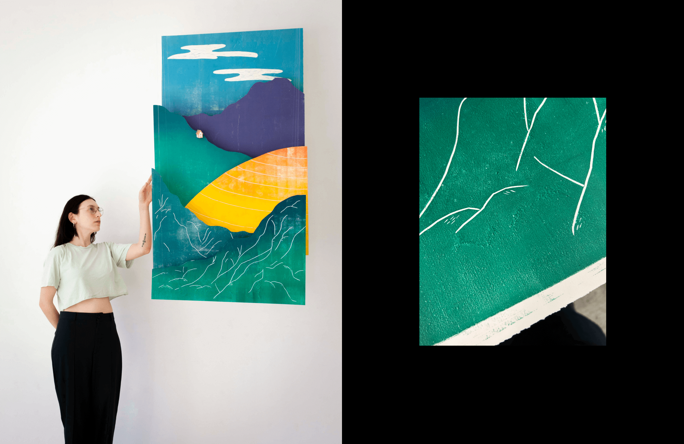
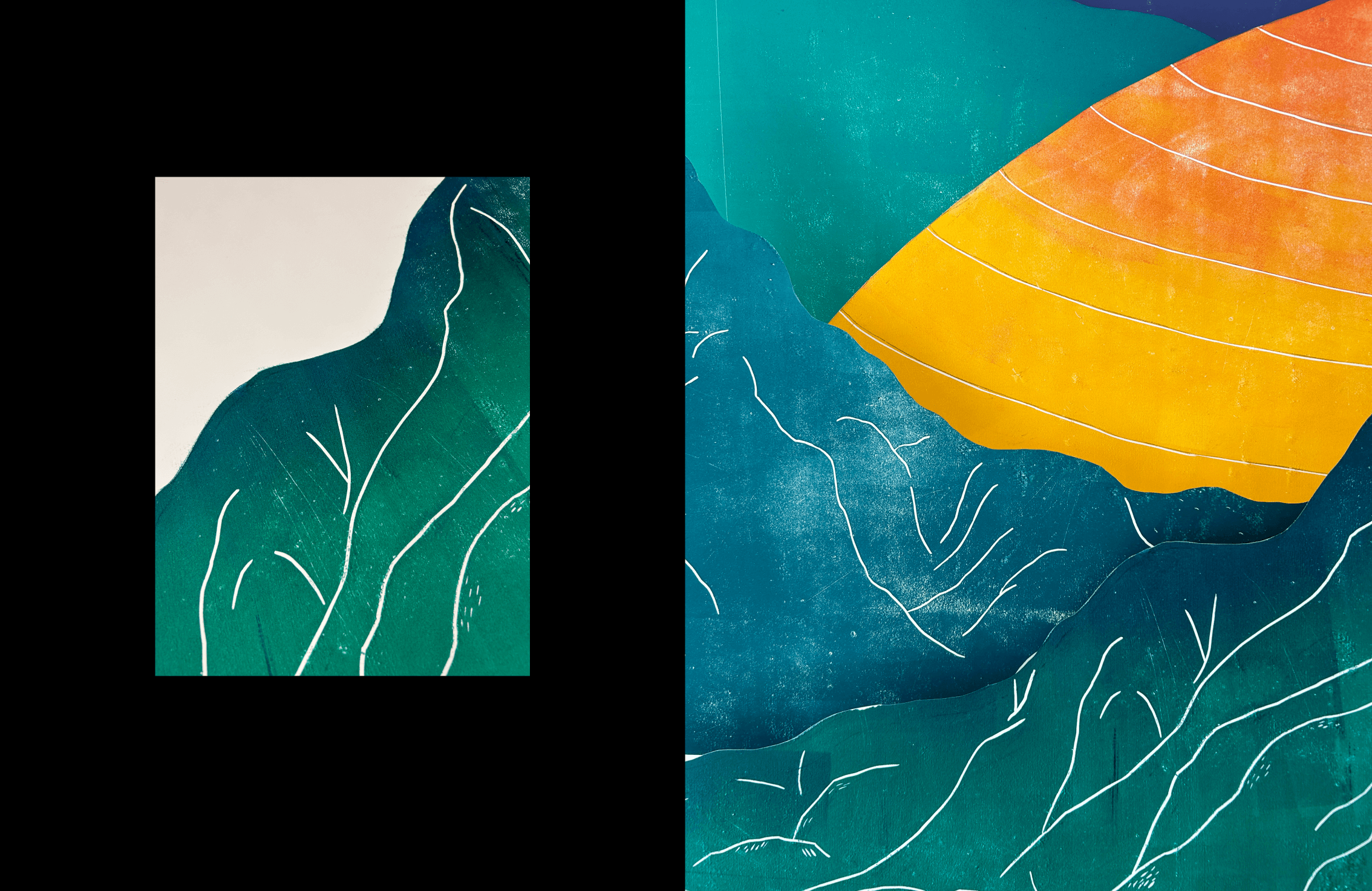
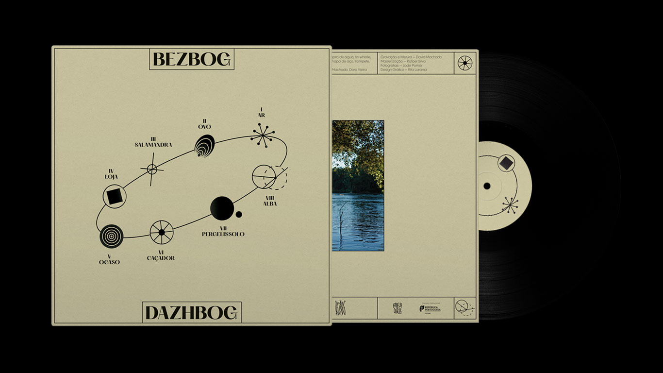
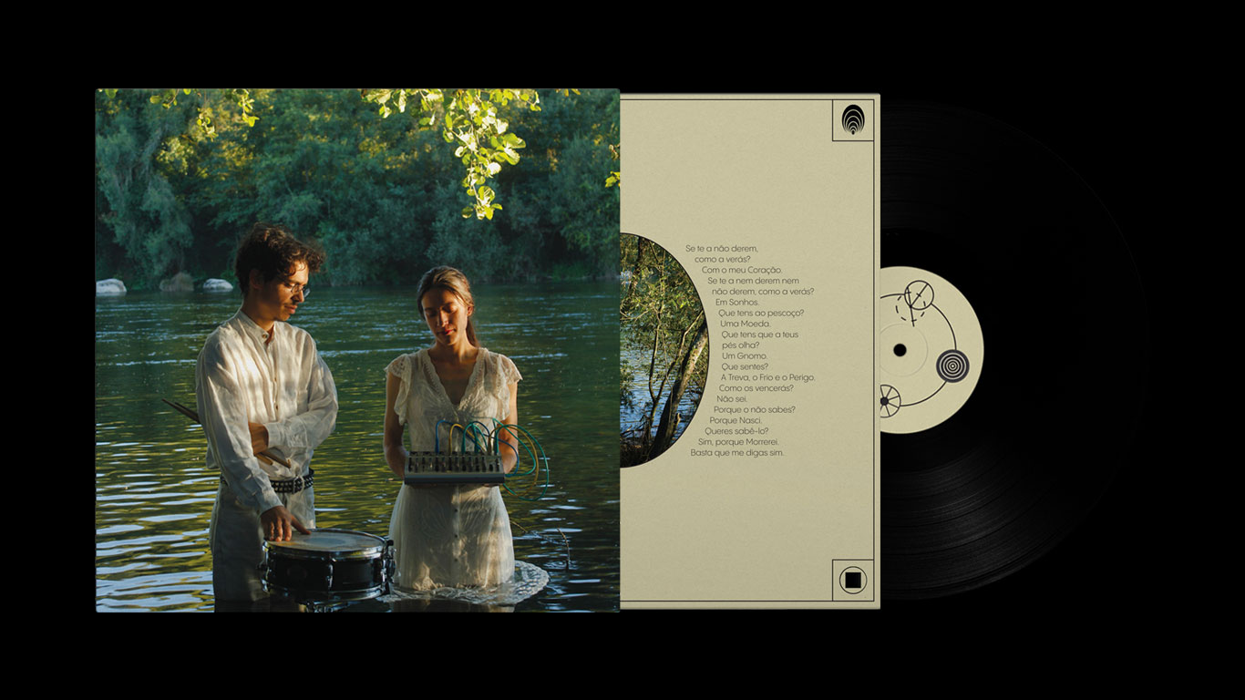
Rita Castilho Sá Couto, also known as Rita Laranja, is a multidisciplinary designer based in Porto (PT). She works in various forms and formats across all platforms, blending the worlds of analog and digital. From idea to execution, she builds creative worlds with a strong focus on art direction.

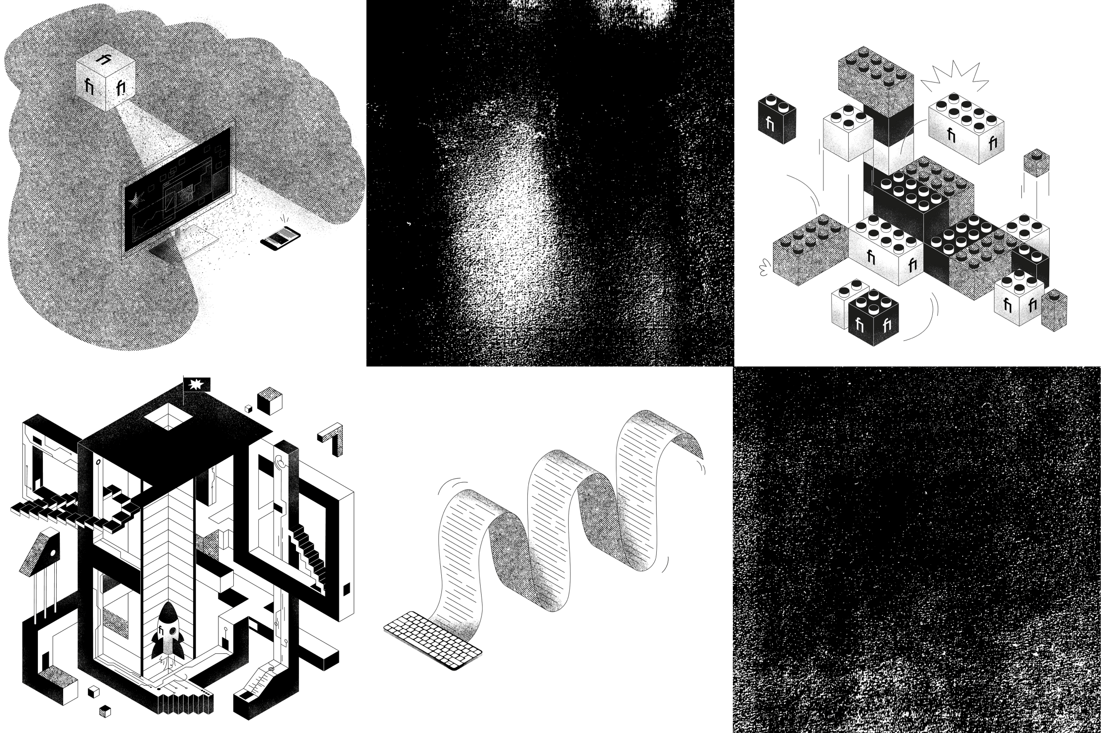
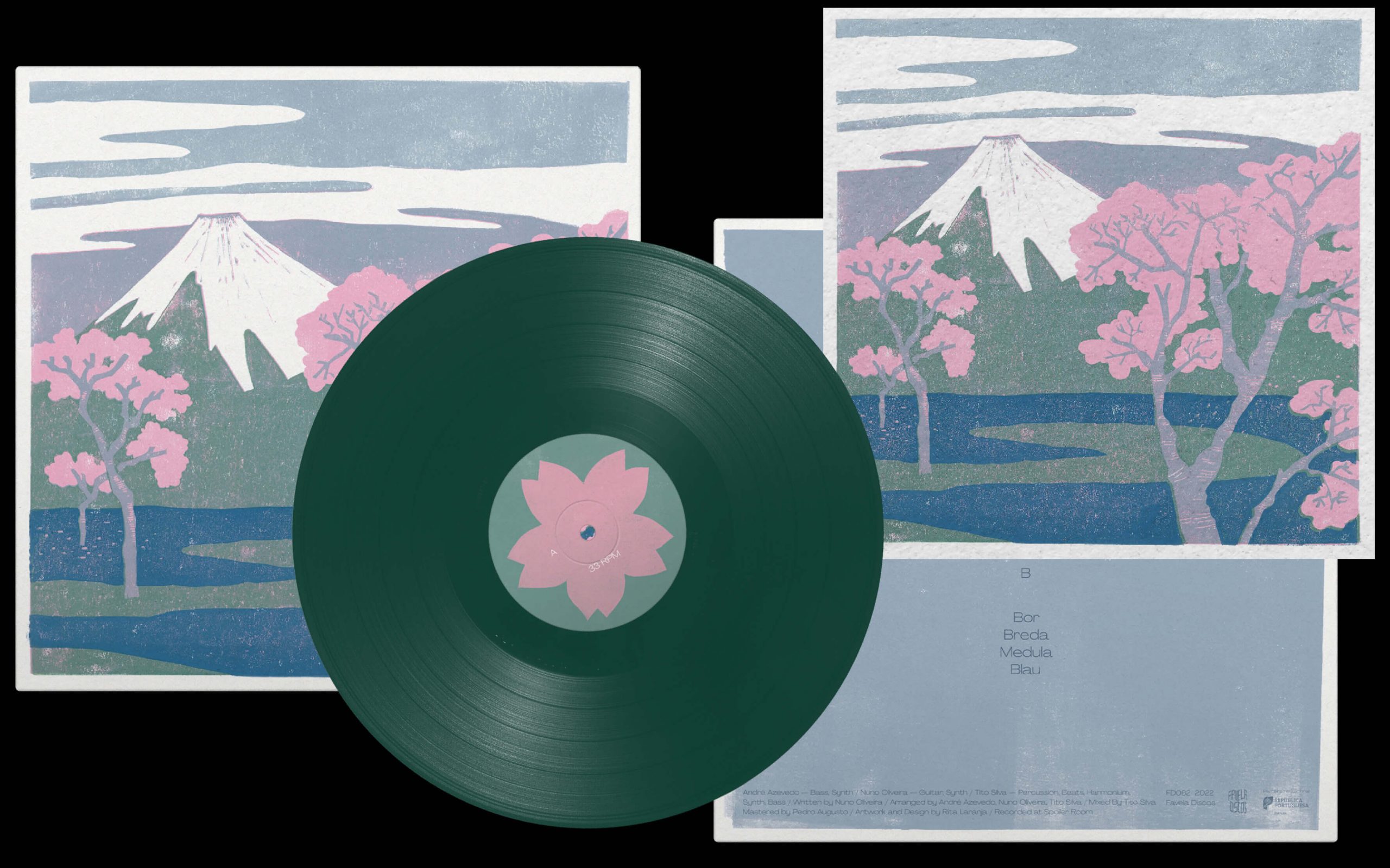
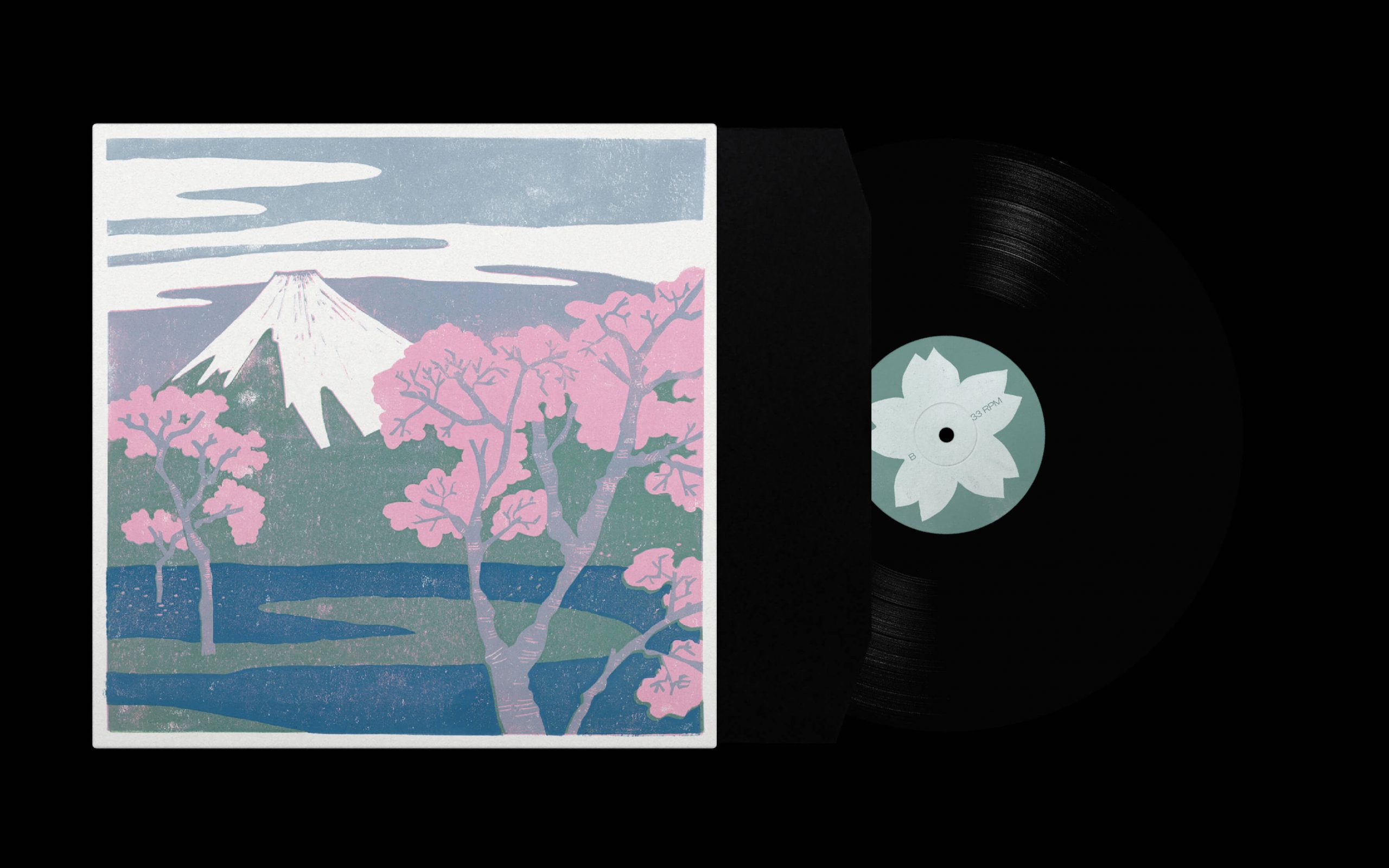
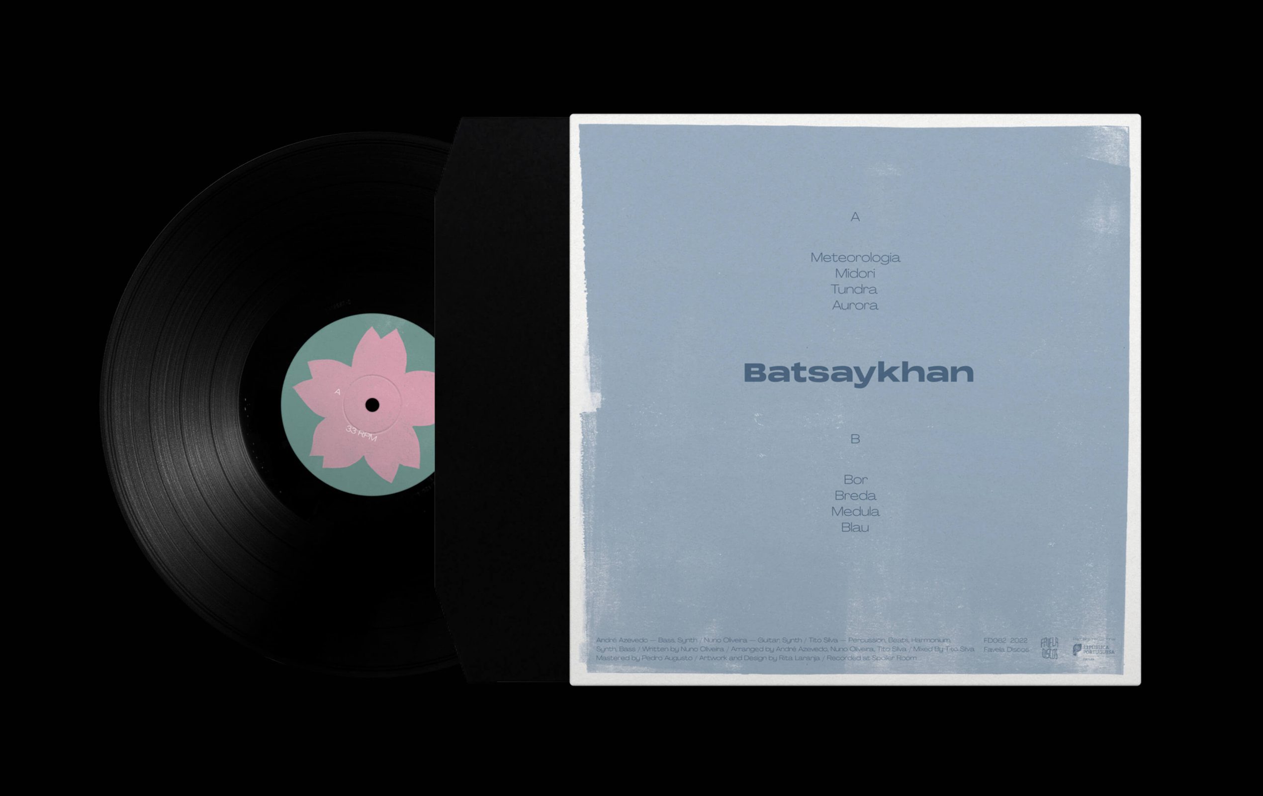
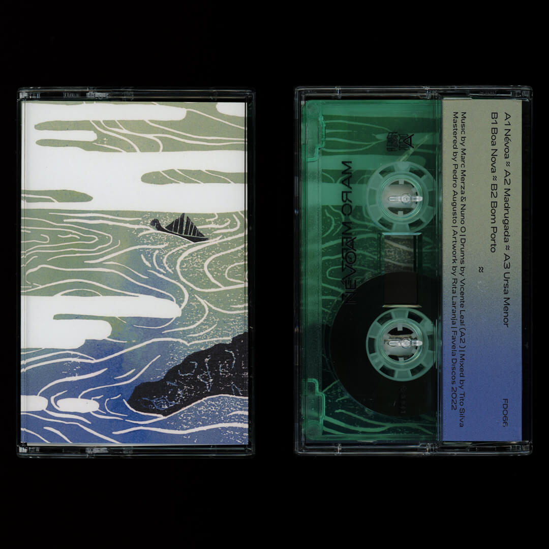
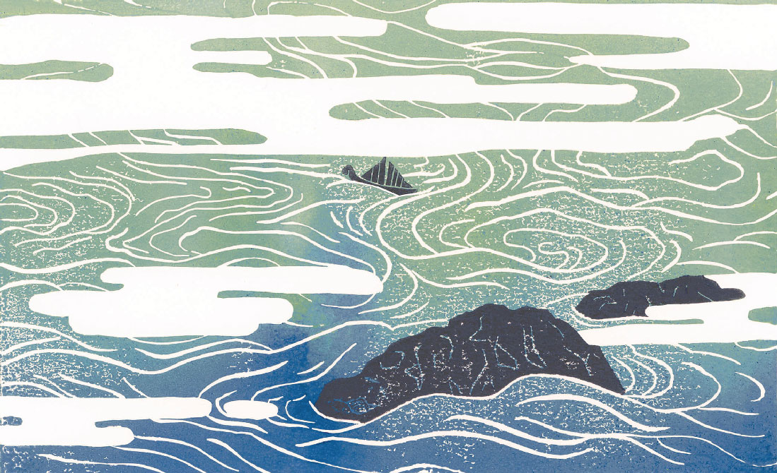
As a printmaker, she is fascinated by various hand printing techniques; thus, most of her personal work takes the form of relief prints created using the lengthy process of lino-cutting and wood-cutting. As a result, her work is defined by the exploration of disruptive visuals with a fascination for analogue methods and imperfect results.

Skills:
Graphic Design
Illustration
Art Direction
User Interface
Album design
Editorial Design
Branding
Ceramics
Graphics for Clothing
Printmaking 
Art & Installation

Experiencing the multiple effects of an unexpected world pandemic, this book brings together a selection of letters from people living in different cities. Sharing their experiences through the pandemic and their hopes for the future.

I thought nothing would fit better than a risograph printed retro futuristic design, showing how the past hoped the future would be. 

Original linocut print artwork and design for the Batsaykhan album.
With 20 limited edition green vinyl records accompanied by an original 4 colour reduction linocut print, signed and numbered by me.
Linocut print available on mu shop!
Album available here.

Kitsune is a hand screen printed collection based on woodcuts I made previously. It is exciting to see how they turned out on different types of materials and different hand printing techniques. 
T-shirts and totes available for purchase on my online store.
Woodcuts available to see on the site below. 

Album design and art direction for Bezbog’s new album.

Artwork and design for Névoa cassette tape.
Cover artwork made with linocut, handprinted.
Find more here.

Yes, very moody.

«Bande à part» is the title of a theoretical project over three volumes by Nuno Brandão Costa about triptychs of architectural works in Europe designed by European architects. For a variety of reasonably s and contexts, these works have become important to the author, having turned into objects of fascination for him and exerting diverse influences on his path as an architect and teacher, from his student days until the present time.

The design of the BANDE À PART collection is inspired by Jean-luc Godard’s title screens and the monoprints are reminiscent of the experimental and noise seen in some of his films.

Judas Triste is a metatechno band based in Porto, created by David Machado, Dora Vieira and Nuno Oliveira to announce a new era of darkness to planet Earth. This prophetic trio of alchemist-musicians transfigures electricity operating an ensemble of electronic appliances and objects mechanically abused.

The artwork was created by the artist João Alves during the recording of the album, materializing the music concept as a painting. So the design represents the cyclical nature of the painting, as you can rotate the painting, you can also rotate the album itself, creating a loop of infinite alchemist music.

riso printed postcards from the city of Breda — NL

«Porto Brutalista» brings together a selection of 20 works in Porto, which aims to propose new ways of interpreting an architecture produced with constructive and material affinities associated with Brutalism. 

The cover design sought to follow these same guidelines and find new ways to communicate what is Brutalist, through an extremely contrasted and strong cover. The interior follows a minimalist design, letting the photography reveal each work.

Art direction and design of the album Lexicon Hall.

Like some sort of digital ayahuasca, the album is an intense psychedelic journey guided by drums and harshly bowed strings, channelling voices from other planes and fusing them with Dies Lexic very own distinctive voice.

Dies Lexic — Lexicon Hall

Favela Discos, 2022

Views of Gerês is an ongoing linocut print series based on the views of one of my favourite places in Portugal, Gerês. 

Available for purchase on my online shop.

Illustrations for the new Finiam’s about page, showing the company’s best features, values and work ethic.
website here

Constant feedback & candor
Simplify & Make it accessible
Learning & Sharing Mindset
Transparency & Honesty

Little animation of Fire Cat, a character from a web comic series I’m releasing on instagram.
Start reading here.

The IN TRUX WE PUX collection was supposed to be presented in 4 different days (1 event per record showcasing some of the artists represented in that volume) but due to the pandemic there could only be one event. So Favela Discos decided to showcase only “Desilusão Óptica” (the music piece from the 2nd volume) which the name is a pun on optical illusion (Desilusão means disappointment / disillusion and Óptica means optical). Thence the exploration of optical illusions on the poster.
I wanted illusions that could translate well not only on screen but also on print, so ended up focusing on the Hering illusion and the Moon illusion. I was quite happy with the result on screen, despite of all the headaches it gave me. The final poster was silkscreen printed by OFICINA ARARA.

IN TRUX WE PUX is a series of 4 records compiling the underground music scene of Porto from recent years and some musical pieces by Favela Discos.
Covers artwork made by various Porto artists showcasing a part of the art scene in the city. 

IN TRUX WE PUX album collection

Favela Discos, 2020